SHINE BRIGHT
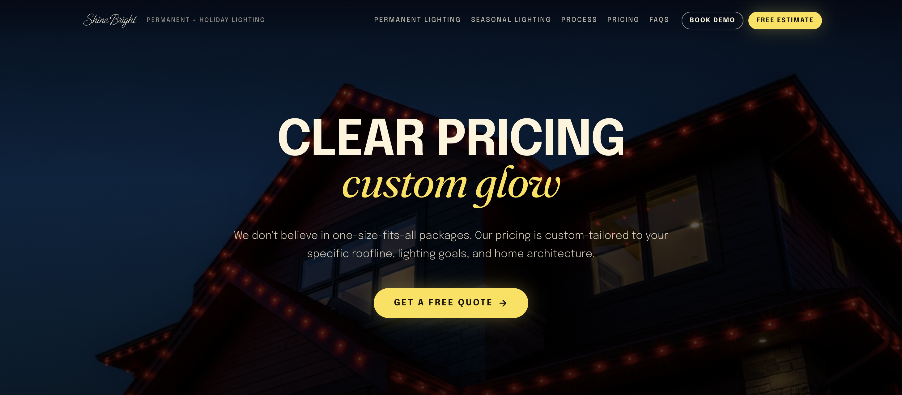
Exterior lighting is a technical product with an untechnical payoff: your house looks cooler. So, I built the site to make the outcome easy to picture, the details simple, and the experience fun.
THE OBJECTIVE
After 10+ years building a name around Christmas lights, Shine Bright was ready to be known for more than seasonal work. The new site needed to introduce permanent lighting without sidelining the traditional lights customers already knew and trusted. It had to strike a careful balance: enough information to help users understand the product, but not so much that it read like a safety manual. The experience needed to sell the feeling first, keeping excitement front and center.
THE EXECUTION
A product this visual shouldn’t need paragraphs of convincing. So, I designed the homepage hero to invite users to try the lights for themselves. Meanwhile, the glowing estimate and demo buttons stay in view to gently guide the next step.
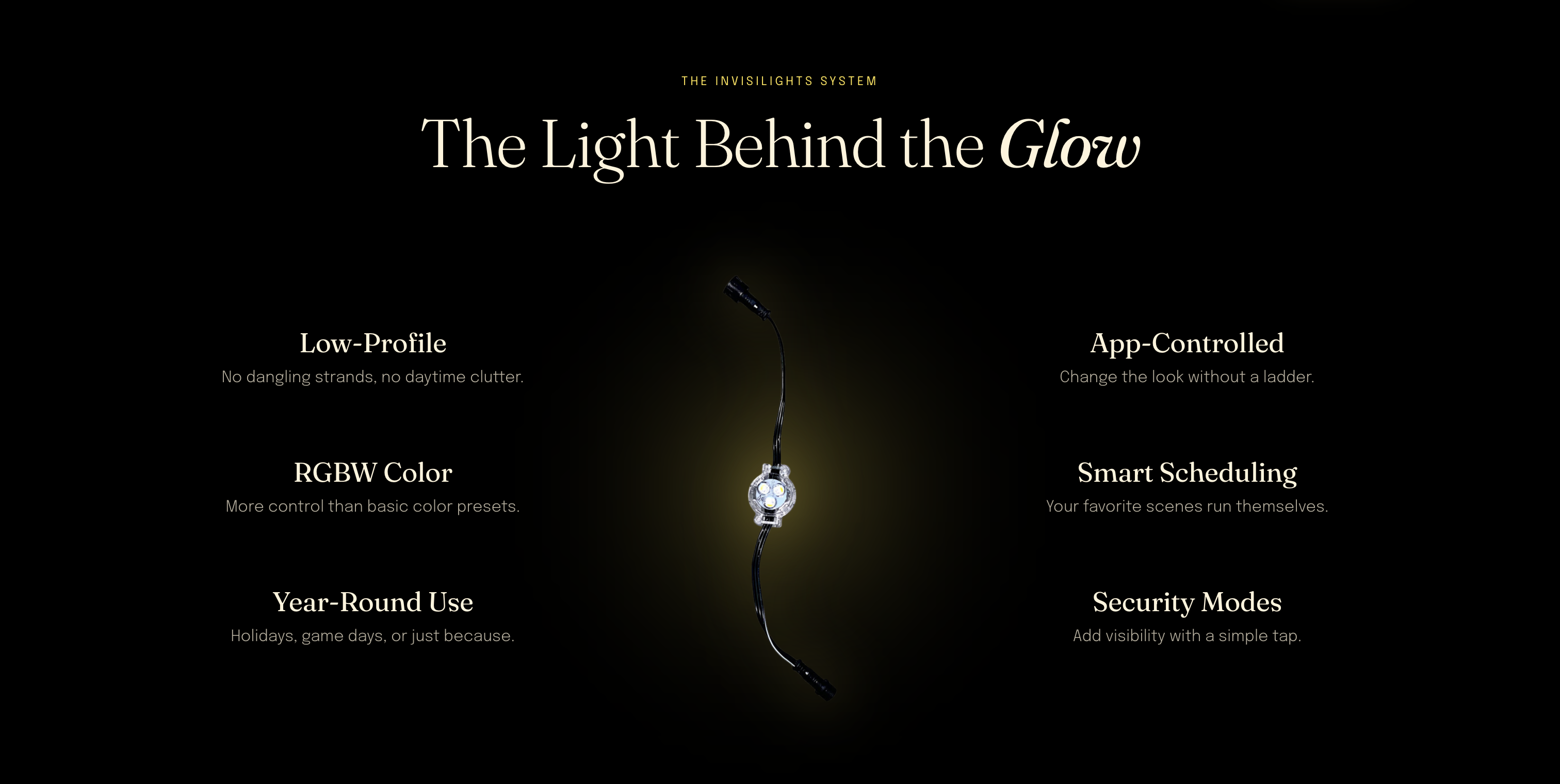
I gave the more technical content a home lower on the page, where it could answer questions instead of creating them. Keeping it visual, I translated the specs into six key benefits that made Invisilights easy to understand at a glance.
To avoid complicating things at the finish line, the estimate and demo forms got the same treatment. They ask for enough information to make the next conversation productive, not for people's whole life story.